

#Short Answer
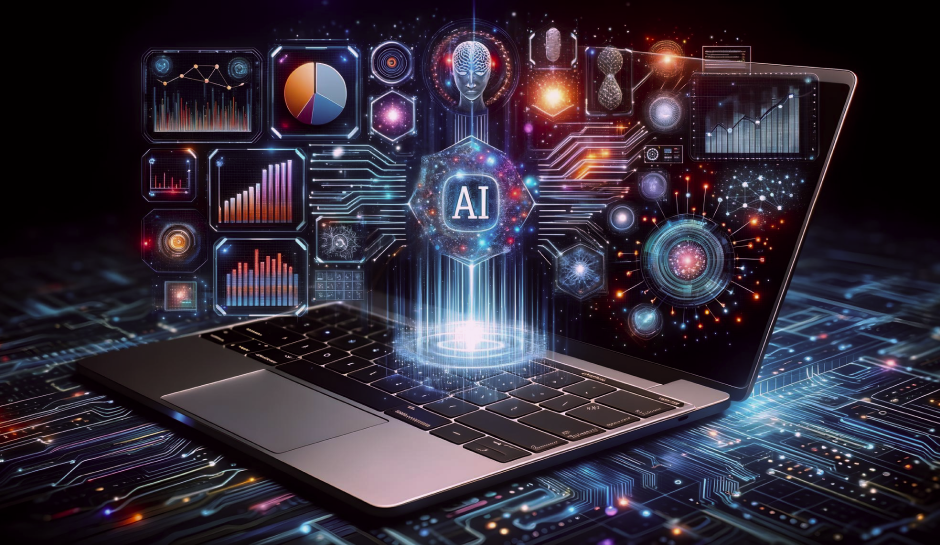
Explores how artificial intelligence shapes visualization and understanding data, covering practical use cases, benefits, limitations, and risks.
#Infobox
Artificial Intelligence in Data Visualization Field Data visualization Subfield Artificial intelligence Key Developers IBM, Google, Tableau, Microsoft, SAS Institute First Appearance Early 2010s Primary Use Enhancing data interpretation through automated visualization Notable Tools Tableau, Power BI, Google Data Studio, IBM Watson Analytics
#Overview
AI-driven data visualization combines the fields of artificial intelligence and data visualization to automate the process of transforming raw data into meaningful graphical representations. Traditional data visualization relies heavily on human expertise to select appropriate chart types, apply design principles, and interpret results. In contrast, AI enhances this process by leveraging algorithms to suggest optimal visualizations, detect anomalies, and even generate natural language explanations of findings.
These tools are particularly valuable in industries such as finance, healthcare, marketing, and supply chain management, where large volumes of data must be analyzed quickly to inform strategic decisions. By reducing the time and effort required to create visualizations, AI enables organizations to focus on deriving insights rather than technical implementation.
#Key Features
- Automated Chart Generation: AI systems can automatically select the most appropriate chart type (e.g., bar charts, line graphs, heatmaps) based on the data structure and intended insights.
- Natural Language Processing (NLP): Users can query datasets using plain language (e.g., "Show me sales trends over the past year"), and AI generates corresponding visualizations.
- Anomaly Detection: AI algorithms identify outliers or unusual patterns in data that may indicate errors, fraud, or emerging trends.
- Predictive Visualization: Some tools use machine learning to forecast future trends and visualize potential scenarios based on historical data.
- Interactive Dashboards: AI-powered dashboards adapt in real-time to user interactions, updating visualizations dynamically as filters or parameters change.
#History / Background
The integration of AI into data visualization began in the early 2010s, coinciding with advancements in machine learning and the growing demand for big data analytics. Early efforts focused on automating basic chart creation, but as AI technologies matured, so did their capabilities in data interpretation.
#Early Developments
In 2012, IBM introduced Watson Analytics, one of the first commercial tools to combine AI with data visualization. Watson could analyze datasets and suggest visualizations based on user queries, reducing the need for manual chart selection. Around the same time, Tableau and Microsoft Power BI started incorporating AI features to enhance their platforms.
The rise of cloud computing and open-source frameworks like TensorFlow and PyTorch further accelerated AI-driven visualization. Researchers began experimenting with deep learning models to interpret complex datasets, such as time-series data or unstructured text, and translate them into intuitive visual formats.
#Modern Advancements
Today, AI-powered visualization tools leverage advanced techniques such as:
- Generative AI: Models like DALL·E and Stable Diffusion have inspired tools that generate custom visualizations from textual descriptions.
- Reinforcement Learning: Used to optimize visualization layouts for clarity and user engagement.
- Computer Vision: Applied to extract insights from images or videos, converting them into data-driven visualizations.
Companies like Google (with Looker and Data Studio) and SAS Institute have integrated AI to provide predictive analytics and automated reporting, further bridging the gap between data science and business intelligence.
#How It Works
AI-driven data visualization operates through a combination of machine learning, natural language processing, and data processing techniques. The process typically involves several stages:
#Data Preprocessing
Before visualization, raw data must be cleaned and structured. AI tools automate this step by:
- Handling missing values through imputation or exclusion.
- Detecting and correcting inconsistencies (e.g., duplicate entries, formatting errors).
- Normalizing data to ensure comparability across variables.
#Intelligent Chart Selection
AI algorithms analyze the dataset's characteristics (e.g., data types, distribution, relationships) to recommend the most effective visualization type. For example:
- A time-series dataset might automatically generate a line chart.
- Categorical data could be visualized as a bar or pie chart.
- High-dimensional data might use scatter plots or parallel coordinates.
#Natural Language Processing
Users interact with AI visualization tools using conversational queries. For instance:
- "Show me the correlation between marketing spend and sales in 2023."
- "Highlight any outliers in customer churn rates."
The AI interprets the query, processes the data, and generates the corresponding visualization along with a textual explanation of the insights.
#Anomaly Detection and Pattern Recognition
AI models, particularly those using unsupervised learning (e.g., clustering algorithms like K-means or DBSCAN), identify anomalies or hidden patterns in data. These insights are then highlighted in visualizations, such as:
- Heatmaps to show density or frequency.
- Box plots to display statistical distributions.
- Network graphs to visualize relationships between entities.
#Real-Time Adaptation
Advanced AI tools dynamically adjust visualizations based on user interactions. For example, if a user filters data by region, the AI updates the chart to reflect only the selected subset, ensuring relevance and interactivity.
#Important Facts
- Accessibility: AI reduces the technical barrier to data visualization, enabling non-experts to create professional-quality charts without coding knowledge.
- Speed: Automated processes can generate visualizations in seconds, compared to hours or days for manual creation.
- Scalability: AI tools can handle massive datasets (e.g., terabytes of data) that would be impractical for manual analysis.
- Bias Mitigation: Some AI systems are designed to flag potential biases in data or visualizations, promoting fairer representations.
- Cost Efficiency: By automating repetitive tasks, organizations reduce labor costs associated with data analysis and reporting.
- Industry Adoption: The healthcare sector uses AI visualization for patient data analysis, while finance relies on it for fraud detection and risk assessment.
#Timeline
Year Event 2012 IBM launches Watson Analytics, integrating AI with data visualization. 2014 Tableau introduces "Ask Data," allowing users to query data using natural language. 2016 Microsoft Power BI adds AI-driven insights, including automated chart suggestions. 2018 Google Data Studio begins offering AI-powered data blending and visualization tools. 2020 Startups like Looker (acquired by Google) and Sigma emerge, focusing on AI-driven business intelligence. 2022 Generative AI tools like DALL·E inspire new visualization platforms capable of creating charts from text descriptions. 2023 Advancements in transformer models enable more accurate natural language queries for data visualization.
#Related Terms
#FAQ
What does AI And Visualization: Understanding Data cover?
Explores how artificial intelligence shapes visualization and understanding data, covering practical use cases, benefits, limitations, and risks.
Why is AI And Visualization: Understanding Data important?
It helps readers understand key concepts, compare practical use cases, and evaluate how Computer Vision decisions affect outcomes, risks, and implementation choices.
What should readers verify before applying this topic?
Readers should compare the benefits, limitations, data requirements, and related themes such as Visualization, Understanding, Data before using the ideas in real projects.
#References
- AI And Visualization: Understanding Data terminology and background research
- AI And Visualization: Understanding Data use cases, implementation examples, and limitations
- Computer Vision best practices, standards, and risk guidance
- Visualization case studies, benchmarks, and current industry analysis


Comments
No comments yet. Start the discussion with a useful note.